Most wellness ad accounts have a format problem before they have a message problem. Open the account and you find forty ads that are the same ad. One creator, one script, one claim, cut to 3 lengths and given 3 thumbnails. The auction has nothing new to learn, so the cost per result drifts up and the team answers with 10 more of the same.
The fix is not more volume. It is more difference. A supplement, skincare or sleep brand has more ways to say one thing than most categories do. A founder explaining why the formula exists. A static that says one sentence. A demo that shows the texture.
Here are 9 formats we would want to see in any wellness account by the end of its first testing cycle: what each is, when it works, what goes in the brief, and the mistake that usually kills it. There are no performance numbers, because they vary by brand, offer and month. The structure does not.
Wellness also sits under the strictest ad policies on both platforms. Meta's health and wellness standard and TikTok's healthcare and weight management policies prohibit cure claims, exaggerated efficacy, anything that generates negative self-perception and, for weight loss, side-by-side transformations. The formats that sell hardest are the ones most likely to cross those lines.
The short version
- Start here: founder-led talking head. Cheapest to make, hardest to fake, and it sets the voice for everything else.
- For people who have never heard of you: problem-first hook video and educational or myth-busting video. They earn attention before they ask for anything.
- For people who know the category but not you: us-versus-them comparison and single-claim static. They help someone choose.
- For people who know you and have not bought: UGC testimonial, press or review carousel, offer-led static. They remove the last reason to wait.
- For products a photo cannot explain: native product demo. Powders, textures, devices, multi-step routines.
How we chose
- Runs on both platforms. Every format here works on Meta and TikTok as vertical video or a static with light adaptation. TikTok's own creative guidance asks for 9:16, sound on and a hook in the first seconds, and that describes Reels too.
- Buildable without a production team. A founder, a phone, a designer and a handful of creators cover all nine. Nothing here needs a studio day.
- A distinct job each. The 9 cover the spread from "did not know they had a problem" to "abandoned the cart yesterday".
- Survives policy review. Each one can be briefed inside Meta's health and wellness standard and TikTok's healthcare and weight management rules. A format that only works when it bends a claim is a rejection waiting to happen.
The 9 formats
1. Founder-led talking head
What it is. The founder, to camera, on a phone, explaining one thing: why the product exists, what they refused to put in it, what they got wrong in the first version.
When it works. Early, when the brand has no proof yet and needs a reason to be trusted, and later as a retargeting layer for people who saw the product but not the person. In wellness, where the reader assumes every brand is a white-label formula with a logo, a real person with a real reason stands out.
What to brief. One belief per video. The first sentence is the strongest opinion the founder holds about the category. Shoot 10 in one afternoon, not one a month.
The common mistake. Having the founder read the mission statement. Nobody stops for "we believe in clean ingredients". They stop for "i spent two years getting magnesium into a gummy and here is why most of them are sugar".
2. Native product demo
What it is. The product doing the thing it does, shot the way a customer would shoot it. A scoop going into water. A serum on the back of a hand. A device being clipped on. Sound on, hands in frame, no voiceover polish.
When it works. When the physical form of the product is part of the pitch: powders that dissolve clean, textures that absorb fast, capsules smaller than the competition, a ritual that takes thirty seconds.
What to brief. The one physical detail that would surprise a first-time user. Build the shot list around it and cut everything else. TikTok's guidance asks for a DIY, not overly polished look, and this is where it matters most: the moment it looks like a commercial, it stops being a demo.
The common mistake. Demoing the packaging instead of the product. An unboxing is not a demo.
3. UGC testimonial
What it is. A customer, or a creator briefed to speak as one, describing their experience in their own words. The camera is theirs. The words are theirs. The brand supplies prompts, not a script.
When it works. Mid-funnel and retargeting, when someone knows the product and needs to hear that it worked for a person like them. The creator should match the buyer on age, life stage and problem, not on follower count.
What to brief. Prompts. "What did your evenings look like before." "What did you notice first." "What would you tell a sceptical friend." Ask for the objection they had before buying; the ad gets built around that line. Get raw takes, not a finished edit.
The common mistake. Two, really. Scripting it, which produces a creator reading marketing copy in a bathroom. And letting the creator make a claim the brand cannot. Both platforms prohibit medicinal claims and exaggerated efficacy, and a testimonial is still an ad. "Cured my insomnia" gets rejected. "i stopped waking up at three" is a story.
4. Us-versus-them comparison
What it is. The product next to the category default, on the criteria that matter. Sugar per serving. Active ingredients. Steps in the routine. Price per day. "Them" is usually "the one you are probably taking now".
When it works. With buyers who already use something and are deciding whether to switch. It gives them a reason to feel good about switching, which is most of the decision.
What to brief. 3 criteria at most, chosen because the product wins on them honestly. A visual that reads in one second on mute. Every line verifiable from the label or the site, because a comparison is a claim and it will be checked.
The common mistake. Winning on criteria nobody cares about. Beating the competition on "vegan capsule" when the buyer is choosing on whether it works is a comparison that helps the competition. Find out what customers actually compared on and use that.
5. Static with a single claim
What it is. One image, one sentence, one product. A headline you could read from across the room and a product shot that does not fight it. No badge cluster, no 3 benefits in a row.
When it works. Everywhere in the funnel, because it is cheap, fast to iterate and easy to read. It is also the format that isolates a message: the same layout with a different sentence tells you something about the sentence.
What to brief. The claim, the proof for it (kept in the brief even if it never appears in the ad), and the one word the designer must make biggest. Brief a family of 5 with the same layout and 5 claims, so the test is the claim.
The common mistake. Adding a second claim because the first felt lonely. A static that says 2 things says nothing. The other mistake is a claim the policy team would strike: "reverses ageing" is out, and anything with a number needs proof you can show. No proof, no claim.
6. Press or review carousel
What it is. A carousel of proof. Card one is a review or a press line, card 2 another, card 3 the product, card 4 the offer. Each card stands alone and the set reads as a wall of other people agreeing.
When it works. Retargeting and warm audiences, where the remaining question is "is this real" and the format answers with volume rather than argument.
What to brief. Real reviews, verbatim, typos left in. A first name and one detail that makes the reviewer a person. Press lines only if the outlet actually wrote them.
The common mistake. Tidying the reviews. A review that reads like copy is copy, and people can tell. The other mistake is quoting a review that makes a claim the brand cannot make itself. A customer saying a product treated a condition does not make the claim compliant. It makes the ad the brand's responsibility.
7. Problem-first hook video
What it is. A video that opens on the problem and holds the product back until the viewer is invested. The first line names a moment the buyer recognises: the 3pm crash, the fifth bad night. The product arrives as the answer, late.
When it works. Cold traffic. People who do not know they are looking for a solution will not stop for a solution, but they will stop for their own problem described accurately. TikTok's guidance puts the hook in the first 6 seconds; this format puts the problem there and pays it back later.
What to brief. The problem in the customer's language, lifted from reviews, support tickets and comments. Not "fatigue". "By four i am useless." 3 openers per script, all 3 shot, because the opener is the test.
The common mistake. Describing the problem in a way that makes the viewer feel bad about themselves. Both platforms prohibit content that generates negative self-perception to sell a health product. "You look tired" is a policy problem and a bad ad. "You are tired" is a hook.
8. Offer-led static
What it is. The deal, stated plainly. Bundle price, subscription saving, first-order discount, free shipping threshold. Product in shot, price in large type, a deadline if there is one.
When it works. The last step. Cart abandoners, past visitors, people who watched the demo and the testimonial and still did not buy.
What to brief. One offer, phrased the way a customer would repeat it to a friend. "Three months for the price of two" beats "save 33%". The exact terms, so the ad and the landing page agree.
The common mistake. Running it to cold traffic. A discount on a product nobody wanted is still a product nobody wanted. The offer closes; it does not open. The second is running the same offer so long it becomes the price.
9. Educational or myth-busting
What it is. A short lesson. What "clinically studied" actually means on a label. Why the timing of magnesium matters as much as the dose. Why most of the category gets one ingredient wrong. The product appears as the practical conclusion, or not at all in the first cut.
When it works. Cold and lukewarm audiences in categories with confusion in them, which is most of wellness. It builds trust from a different angle than the founder video: competence instead of conviction.
What to brief. One fact the buyer does not know, that changes what they should buy, that the brand can back up. Talking head, screen recording or a sketch all work; the format is the idea, not the production.
The common mistake. Teaching something true that leads nowhere. If the lesson does not end in a choice the product wins, it is content, not an ad. The other mistake is sliding from education into a medical claim. Explaining what an ingredient does in the body is education. Saying the product treats a condition is a claim both platforms prohibit.
Which formats to test first
The order depends on what the account already has, not on the list.
If the account is new or has one format in it, start with the founder talking head and the problem-first hook. One establishes who is talking, the other who is listening. Both produce the raw language the other 7 are built from.
If the account has volume but every ad looks the same, add the 2 formats furthest from what is running. Usually that is a single-claim static and a comparison, because most wellness accounts are heavy on creator video and light on anything that reads on mute.
If warm traffic converts badly, that is a proof problem: add the review carousel and the offer static before touching the top. And if the product is one a photo cannot explain, the demo goes in first, whatever else is true.
3 briefing rules that hold across all nine
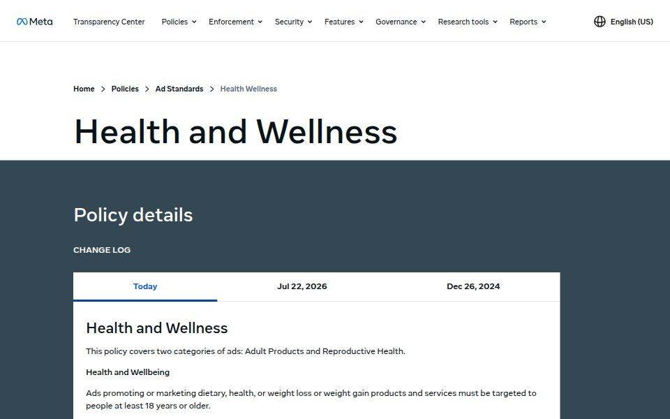
Brief the claim and the proof together. Every format above makes a claim, even the demo. Write the claim in the brief and, next to it, where the proof lives: the label, the study, the review, the founder's own history. If the proof column is empty, the claim does not ship. This one habit removes most policy rejections.
Change one variable at a time. A new hook on a new creator with a new offer teaches you nothing when it wins and nothing when it loses. Change the opener, or the creator, or the claim. Not all three.
Brief for the mute viewer and the sound-on viewer separately. TikTok's guidance asks for sound on and text overlays at 5 to 10 words a second. Some Meta feed placements are sound-off by default. The same cut has to work in both, which means the first frame carries text and the first second carries a voice.
Working with HYLN Hub
We are a 2-person creative strategy studio in Barcelona, working with DTC wellness, supplement, beauty and lifestyle brands in Europe and the U.S. We do the research, the concepts, the briefs, the testing plan and the read-out. Your editors, designers and creators make the assets from our briefs; we approve and hand to your media buyer. We take on a limited number of brands at a time. If the 9 formats above describe a gap in your account, the conversation starts at hylnhub.com/apply.
FAQ
Do we need all 9 formats running at once?
No. 4 or 5 live at a time, chosen for the stage the brand is at, is usual. The list is about coverage across a testing cycle, not a launch checklist.
Can before-and-after creative still run for wellness products?
It depends on the product and the platform. Meta's health and wellness standard prohibits side-by-side transformations for weight loss and anti-ageing treatments, and TikTok restricts them for supplements in several markets. Cosmetic products have more room, provided the creative avoids negative self-perception. Read the current policy for your category before briefing it.
Does the same creative work on Meta and TikTok?
The formats do. The cuts often do not. TikTok expects a less polished, creator-native feel and a faster hook; Meta placements span feeds, Stories and Reels, and some are sound-off by default. Brief the concept once and the edit twice, with the safe zones and the opening seconds adjusted for each.
Should we use AI-generated creators for UGC?
Only if the ad says so and the platform's rules for synthetic content are followed. The UGC format works because a real person had a real experience. Replacing the person removes the reason. Keep the human in the testimonial.
Sources
- https://ads.tiktok.com/help/article/creative-best-practices
- https://ads.tiktok.com/help/article/tiktok-ads-policy-healthcare-pharmaceuticals
- https://ads.tiktok.com/help/article/tiktok-ads-policy-weight-management
- https://transparency.meta.com/policies/ad-standards/restricted-goods-services/health-wellness/
- https://transparency.meta.com/policies/ad-standards/